Alternative Assisstant Mockup
- Dampfnudel
-
Topic Author
Less
More
Hi! I was quite unhappy about the new Assisstant GUI, so I just made a mockup of what I would like it to be. Note that I'm still confused about the concept of profiles and presets because I've used Reshade just a few times + maybe I missed some things + I didn't put much thought in it but its just a mockup anyways. I did this just by using Eclipse + Windowbuilder addon and some little code changes. The window is perfectly resizable and the only thing SWING can't do is checkboxes for the shader list but you can download a control like that somewhere on the internet. Also Java would make it multiplatform so maybe the idea is not that bad ")


PS: If you don't recognize the worm guy, please leave the internet
Warning: Spoiler!
PS: If you don't recognize the worm guy, please leave the internet
The following user(s) said Thank You: robgrab, OtisInf
Please Log in or Create an account to join the conversation.
- robgrab
-

Less
More
I like this. Much easier to navigate and make sense of.
Please Log in or Create an account to join the conversation.
- kasakka
-

Less
More
I agree. The current assistant seems to be unresponsive most of the time and it's really hard to figure out. Seriously terrible UI design.
Please Log in or Create an account to join the conversation.
- OtisInf
-

Less
More
8 years 1 month ago - 8 years 1 month ago #4
by OtisInf
Replied by OtisInf on topic Alternative Assisstant Mockup
Java would be a crappy choice for the UI, to be honest, as it doesn't look native, it requires java to be present on the system (not a given, in fact java on the client is discouraged so not many have java installed) and multiplatform isn't required as reshade is a windows only library.Dampfnudel wrote: Hi! I was quite unhappy about the new Assisstant GUI, so I just made a mockup of what I would like it to be. Note that I'm still confused about the concept of profiles and presets because I've used Reshade just a few times + maybe I missed some things + I didn't put much thought in it but its just a mockup anyways. I did this just by using Eclipse + Windowbuilder addon and some little code changes. The window is perfectly resizable and the only thing SWING can't do is checkboxes for the shader list but you can download a control like that somewhere on the internet. Also Java would make it multiplatform so maybe the idea is not that bad
") Nevertheless, I applaud the effort, as a good UI tool is needed.
Nevertheless, I applaud the effort, as a good UI tool is needed.How the profiles work is that you have per game a series of presets existing of shader configs and global settings. So the UI should start with selecting the game you want to work on, then presets defined for that game at this moment, then per preset what you can edit (e.g. shaders, pipeline, global reshade settings).
Regarding editing shader parameters (the meat of the tool anyway), Sony has released as OSS their tool framework some time ago on github. It's windows forms and in general looks like crap but it does come with some nice controls which will fit a tool like this perfectly, like their custom property grid, which offers rich editing possibilities for a variety of different types like floats.
Last edit: 8 years 1 month ago by OtisInf.
Please Log in or Create an account to join the conversation.
- crosire
-

Less
More
I'd like a simpler looking tool, which works like any normal Windows application. But Ganossa put a lot of effort into his work and I would feel bad simply throwing it away. I'm in a bit of a dilemma here...
Please Log in or Create an account to join the conversation.
- Dampfnudel
-
Less
More
I heard that Linux support might be possible in future. Also I think that the chance for a typical gamer to have Java installed is just as high as like that he has .NET Framework or C++ Redist installed. Also you can make your Java App look native if you want by using native controls. But I like that you can create your own "look and feel" with SWING and I think thats the reason why Ganossa uses something like WPF anyway instead of just plain WinForms.OtisInf wrote: Java would be a crappy choice for the UI, to be honest, as it doesn't look native, it requires java to be present on the system (not a given, in fact java on the client is discouraged so not many have java installed) and multiplatform isn't required as reshade is a windows only library.
Sadly, SWING does not come with such a control. But I'm sure you can find something like that on the Internet. Actually It's nothing more than a table with different editing controls depending on data type (if Sonys control is what I think it is).OtisInf wrote: Regarding editing shader parameters (the meat of the tool anyway), Sony has released as OSS their tool framework some time ago on github. It's windows forms and in general looks like crap but it does come with some nice controls which will fit a tool like this perfectly, like their custom property grid, which offers rich editing possibilities for a variety of different types like floats.
Yeah I know that and I certainly don't want him to switch to Java or start all over. I haven't used WPF at all but as far as I know it's something like a Windows equivalent to Java SWING. So atleast changing the look of controls would be very easy and would help much (adding some contrast to seperate controls from another and maybe make them bigger). Or to use the native Window Frame and Control Box would also be very easy. Changing the layout on the other side is much harder and I'm okay with it, if he doesn't like to do that.crosire wrote: I'd like a simpler looking tool, which works like any normal Windows application. But Ganossa put a lot of effort into his work and I would feel bad simply throwing it away. I'm in a bit of a dilemma here...
Please Log in or Create an account to join the conversation.
- piltrafus
-

Less
More
8 years 1 month ago - 8 years 1 month ago #7
by piltrafus
Replied by piltrafus on topic Alternative Assisstant Mockup
crosire wrote: I'd like a simpler looking tool, which works like any normal Windows application. But Ganossa put a lot of effort into his work and I would feel bad simply throwing it away. I'm in a bit of a dilemma here...
I wouldn't look at it as throwing anything away. Instead it would be more like moving forward and building on what's been learned. Many users have completely passed on reshade 2.0 after 5 minutes with the assistant tool. I did the same after a few failed attempts. Still playing games with 1.1 except for one game. I never used assistant as it failed to do what I wanted. I use notepad++ for reshade 2.0.
Some good suggestions were given as to how to improve the assistant but only mild changes were implemented. Sometimes you need pliers to fix something, sometimes you need an axe.
The star of this show is obviously Reshade. It's brilliant and we all want it. Assistant is a bit like the band manager trying to be the frontman. It has a clear job to do but instead gets in the way and cuts the flow of things. And please don't take it personally. It's just a flawed design decision. No more no less. It can be fixed but it needs an axe.
Design conventions are good. So people know what to do before even using the tool. For example a convention for gun design would be that no bullet is shot unless a trigger is pressed. You don't respect that and you'll get some angry customers
Regards.
Last edit: 8 years 1 month ago by piltrafus.
Please Log in or Create an account to join the conversation.
- Ganossa
-

Less
More
8 years 1 month ago - 8 years 1 month ago #8
by Ganossa
Replied by Ganossa on topic Alternative Assisstant Mockup
1. A tool was requested by the community (mainly previous GEMFX users), its not my main focus in this or the GEMFX project
2. The tool initially had a standard windows UI but was criticized for it (the first of the 3 iterations)
3. Look through the history and you will find out that I always preview the design so there is enough time to talk before its released
4. Please consider that I currently have VERY limited amount of time due to private changes (some days you have more and some days less time, that's how it always is)
That said, something along those lines?
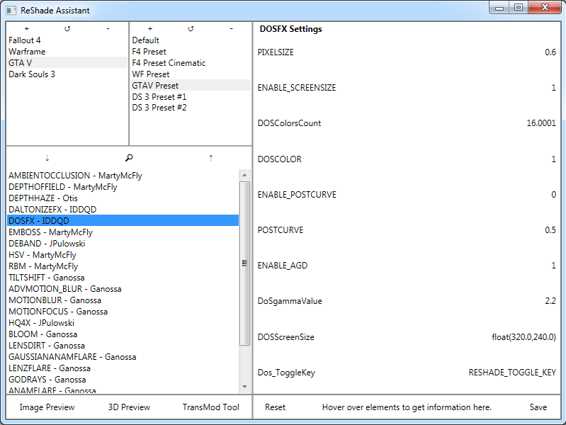
By the way, please ignore the layout of the shader values. It only serves as preview where what will show up.
Also the 3 "tool" button could have different UI actions which cannot be seen here (its anyway not the main functionality of the tool).
2. The tool initially had a standard windows UI but was criticized for it (the first of the 3 iterations)
3. Look through the history and you will find out that I always preview the design so there is enough time to talk before its released
4. Please consider that I currently have VERY limited amount of time due to private changes (some days you have more and some days less time, that's how it always is)
That said, something along those lines?
By the way, please ignore the layout of the shader values. It only serves as preview where what will show up.
Also the 3 "tool" button could have different UI actions which cannot be seen here (its anyway not the main functionality of the tool).
Last edit: 8 years 1 month ago by Ganossa.
The following user(s) said Thank You: piltrafus
Please Log in or Create an account to join the conversation.
- piltrafus
-
Less
More
Looks like success to me. Great layout with everything in view. Left to right for intuitive workflow. Simple and also pretty on the eyes. Congrats. Great job.
Functionality notes:
- Please don't use mouse hovering to select. Left click as usual. Please.
- Please add an option to hide unused shaders on shader list/pipeline. So workflow could be: activate shaders, hide unused, sort order for enabled shaders, edit shader settings.
Functionality notes:
- Please don't use mouse hovering to select. Left click as usual. Please.
- Please add an option to hide unused shaders on shader list/pipeline. So workflow could be: activate shaders, hide unused, sort order for enabled shaders, edit shader settings.
Please Log in or Create an account to join the conversation.
- kasakka
-
Less
More
That looks a lot clearer and doesn't require tilting your head to figure out the sections.
I'd suggest adding some sort of labels for which section is which and of course color the background where you have those controls. The +/-/search or up/down/search buttons should be grouped so that the up/down/+/i are together next to each other and search is actually a search field. The current Assistant feels quite alien somehow so banking on UI familiarity would be a big plus here.
For search I think an option for "hide non-matching results" would be good so instead of still having a long list with just some items dimmed you would just have the relevant items.
Another good thing would be highlighting changed settings and showing what their value was before the change. This way it's easier to for example play around with someone else's config and always know where you are.
Please Log in or Create an account to join the conversation.
- OtisInf
-
Less
More
8 years 1 month ago - 8 years 1 month ago #11
by OtisInf
Replied by OtisInf on topic Alternative Assisstant Mockup
It would be great if you stop combining 'pipeline' with 'list of available shaders' . Those aren't the same thing: pipeline is the list of shaders one wants to use, in a given order, 'list of available shaders' is just that, the complete list. Solves the dreaded problem of selecting one in your current list and whether or not that 'enables' the shader or not. I've always found that very confusing.
It also makes the user aware of what the pipeline really is, so the user can simply select the shaders to 'add' to the pipeline and auto-sort them. I know it's ambiguous to have both a pipeline with shaders and also #defines where one enables / disable a shader, but I guess that's the result of the design that's there.
You could then also 'auto-enable' shaders which are added to the pipeline (or add shaders to the pipeline if the user 'enables' them).
I think the main gripe comes from the fact that it's confusing to have to order a list of 'available shaders', as that makes no sense: one wants to have that list in an order that helps the user to easily find a shader to work on, and the pipeline makes things look ordered using 'chaos mode'
. Those aren't the same thing: pipeline is the list of shaders one wants to use, in a given order, 'list of available shaders' is just that, the complete list. Solves the dreaded problem of selecting one in your current list and whether or not that 'enables' the shader or not. I've always found that very confusing.It also makes the user aware of what the pipeline really is, so the user can simply select the shaders to 'add' to the pipeline and auto-sort them. I know it's ambiguous to have both a pipeline with shaders and also #defines where one enables / disable a shader, but I guess that's the result of the design that's there.
You could then also 'auto-enable' shaders which are added to the pipeline (or add shaders to the pipeline if the user 'enables' them).
I think the main gripe comes from the fact that it's confusing to have to order a list of 'available shaders', as that makes no sense: one wants to have that list in an order that helps the user to easily find a shader to work on, and the pipeline makes things look ordered using 'chaos mode'
Last edit: 8 years 1 month ago by OtisInf.
Please Log in or Create an account to join the conversation.
- kingeric1992
-

Less
More
8 years 1 month ago #12
by kingeric1992
Replied by kingeric1992 on topic Alternative Assisstant Mockup
Here is what I think:
Per-shader config file to specified #defines that required to be loaded into assistant tool, along with effect name, infos, authors, and if possible, UI element for the tool like min/max/UItype syntax.
Instead of auto-sort or predefined pipeline order,
change the standard to have "texture in/out" in shader to allow re-usage on different stage in the pipeline or on different textures, which essentially enables the ability for users to have custom pipeline setup and thus allowing more flexibility for creating artistic presets.
The following user(s) said Thank You: OtisInf
Please Log in or Create an account to join the conversation.
- Dampfnudel
-
Less
More
8 years 1 month ago - 8 years 1 month ago #13
by Dampfnudel
Replied by Dampfnudel on topic Alternative Assisstant Mockup
I like, where this is going and I took the picture and changed some things to my liking. What about this? 

Also the "debug" version where you can see the borders of some controls.

I think buttons that visually react to mouse hover and mouse down are really important with this flat design.
Also I'm not sure if this background pattern on the list is a good idea or if it can be done easily.
I got the icons from www.iconfinder.com but I don't know if you can distribute them. And to generate such small image files you should generate them with Inkscape or something like that from the svg-files. I didn't do that and now the update icon looks terrible
Also the "debug" version where you can see the borders of some controls.
I think buttons that visually react to mouse hover and mouse down are really important with this flat design.
Also I'm not sure if this background pattern on the list is a good idea or if it can be done easily.
I got the icons from www.iconfinder.com but I don't know if you can distribute them. And to generate such small image files you should generate them with Inkscape or something like that from the svg-files. I didn't do that and now the update icon looks terrible
Last edit: 8 years 1 month ago by Dampfnudel.
The following user(s) said Thank You: kasakka
Please Log in or Create an account to join the conversation.
- kasakka
-
Less
More
You could also reduce the padding in the settings box (the largest one) so you can more easily fit more options on screen. Otherwise I think that mockup by Dampfnudel looks pretty good to me.
Might be a good idea to also allow using the mouse to increment/decrement values so people can do quick adjustment without reaching for the keyboard.
Might be a good idea to also allow using the mouse to increment/decrement values so people can do quick adjustment without reaching for the keyboard.
Please Log in or Create an account to join the conversation.
- Ganossa
-
Less
More
As a response to your guys feedback:
What changed is the visual separation of available shaders and active shader+their ordering.
A double click on a shader in the shaders list would add/remove a shader to/from the ordering list and activate it. However, behind this is still the pipeline file so it will automatically be ordered according to its content cause I would not like to make it more complicated for those that do not want to bother about ordering all the time they setup a preset.
Clicking on a shader in either list will mark the shader also in the other list and bring up the settings.
The shaders list on the other hand will be ordered by name but of course also contain all available shaders from the pipeline file
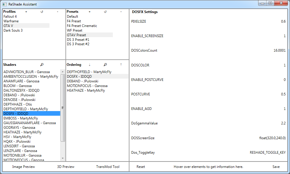
Lets not talk about formatting by the way, those are just concepts
What changed is the visual separation of available shaders and active shader+their ordering.
A double click on a shader in the shaders list would add/remove a shader to/from the ordering list and activate it. However, behind this is still the pipeline file so it will automatically be ordered according to its content cause I would not like to make it more complicated for those that do not want to bother about ordering all the time they setup a preset.
Clicking on a shader in either list will mark the shader also in the other list and bring up the settings.
The shaders list on the other hand will be ordered by name but of course also contain all available shaders from the pipeline file
Lets not talk about formatting by the way, those are just concepts
The following user(s) said Thank You: piltrafus, OtisInf, Dampfnudel
Please Log in or Create an account to join the conversation.